Categories
Technical

HOW many tabs?

Update – 12/11/2021: A while back I switched to a Chromium-based browser, I’ve documented the new approach here.

My Problem

Everyone I work with at some point mentions my browser tab mismanagement. As of right now, I have 135 tabs open, but that’s definitely at the lower bounds of where I am typically at.
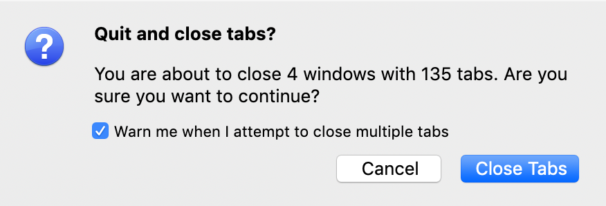
Screenshot of Firefox close tabs dialog.

For years I suffered under of Chrome’s tab Toblerone of death (“Tablerone”?), which constantly reminded me of my dysfunction with only an icon to identify which tab was which.

Recently, I started using Firefox again and it enabled my problem by presenting my open tabs in a carousel UI. So it wasn’t until my Mac told me I had no memory left that I realised how bad it had got.

The carousel obfuscates the exact number of tabs I have open – leaving the quickest (and only obvious) way to find out in Firefox through hitting CMD+Q – which triggers the above dialogue.

It may sound like this is kind of a weird brag, but it’s not. This problem isn’t one I’m delighted with having. My open tabs present a combination of lackadaisicalness (in that sometimes I just plain forget to quit out of them) and flawed aspiration (“I’ll get to reading that imminently”). By the time I get to declaring tab-bankruptcy and bookmarking them (using a combination of the OneTab extension and Pinboard ), they’ve amassed to a point where I sometimes no longer know why they’re there.

The Tool

Yes, I obviously have a problem. And once I’d admitted it, I started looking into ways to manage it. My chosen approach would be to better surface the above number, so at least it would become more quickly apparent that I’d gone too far.

I don’t want to move away from Firefox, and I don’t want to have to threaten to quit anytime that I want an update on my tab count. Nothing obvious was coming up in my searches until a little later I was pursuing another itch (hyper customisable window management, if that matters) where I stumbled upon some articles about a tool called Mjolnir, which had been forked to a more batteries-included tool called Hammerspoon.

The Hammerspoon splash page does a better job of describing it, but the tl;dr is it adds a scripting layer to MacOS using Lua. This seemed powerful enough for me to craft something that might suit my needs here.

Crafting A Solution

So with my hammer in hand, I needed to craft a way to address my “issue”. I’m a big fan of “Quantified Self“, and Continuous Improvement – both philosophies that involve surfacing and using data about yourself to improve a situation. So I figured – if that number is always in my face, shouldn’t I naturally try to optimise it now and again?

With that question in mind, I started looking at the Hammerspoon API, and initially, I figured this would be easy. Hammerspoon surfaces a method on a Window called tabCount, so this should be incredibly easy to integrate. Unfortunately not – the data it returns in Firefox isn’t representative of how many tabs you have open. At a guess, I expect Firefox isn’t using a native macOS tab implementation, and so this was an immediate dead end.

Then I started looking at methods in Firefox for surfacing this number. I’m sure I could automate a brute force counter somehow, but I don’t know how I might implement that in the background without interrupting the user. Firefox tracks “telemetry” for reporting browser usage. I found that stuff dead interesting, I’d encourage you to give it a read (all of the data is viewable in your instance at about:telemetry).

However, the only relevant number I’ve found is `browser.engagement.max_concurrent_tab_count`, and that only reflects the maximum number of tabs you’ve opened in that session. Which isn’t great when you’re trying to get that number down. Also, it doesn’t seem simple to query that data – you can get all sorts from FF’s SQLite databases, but I never landed on this value.

After lots of faffing, I finally discovered the session restore file found in your Firefox Profile directory at `sessionstore-backups/recovery.jsonlz4`. It’s the file that Firefox uses to restore your session when it runs out of memory because you’re an idiot who had too many tabs open. The file is massive – particularly if you have large amounts of tabs open – and in a slightly arcane format – lz4 – which on reading, you’ll see is a suitable compression format for the problem at hand. I expected that if we can parse that file quickly, it should be suitable for the job we have here – reporting regularly on the current number of tabs open.

Implementing a Firefox Tab Counter in Hammerspoon

First of all, I needed a fast way of reading that file. After some digging and pissing on with weird different libraries, I managed to get a fork of lz4json compiling locally – not only did it work, but it was fast:Screenshot showing that running the lz4jsoncat utility on my session backup took 0.011 secondsThen I needed to parse it. Instinct got me going down the “I’ll write some javascript for this” path, but I quickly realised that for fast feedback, I needed something close to the metal, simple, and again fast. So I dived into what describes itself as “sed for JSON data”, jq, and realised that this type of problem was its bread and butter.

Piping the above catted file into this strange incantation:

| jq 'reduce (.windows[] .tabs | length) as $length (0; . + $length)'

gives you a value that matches up exactly with the dialog box we get when hitting CMD+Q. Woop!

To try and explain the above, `.windows[] .tabs` gives you an array of tabs in each window. `| length` gives you the result of the length method applied to that array. And reduce applies a reduce operation to each of those windows, in our case adding them to get a total amount of tabs open.

Combine all of that into a little shell script, and by applying our ultra scientific `time` method of measuring the speed of it all, we still get sub-tenth of a second times:
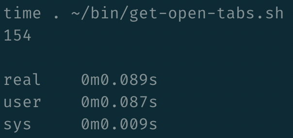
timing the shell script gives a result of 0.089 seconds

That strikes me as a fast and feasible way of retrieving a tab count. So next step – surfacing it somewhere obvious. Working through the Hammerspoon getting started guide, you quickly come to a tutorial around simulating Caffeine in the menubar. This was incredibly straightforward and seemed like a nice obvious first step for getting stuff somewhere. So that’s what I did – we run the get open tabs script, and put the result of that in the menubar, using Hammerspoon’s PathWatcher utility to update that number whenever our session restore file changes.

I added a couple of enhancements, but nothing hugely complex – a limit constant that turns our number red when our open tabs are greater than it (at time of writing, I’ve exceeded it by 70 😬). And I had a play with creating an icon, which was incredibly straight forward. It’s based on this “format” (if you can call it that), which is self-documenting enough that I figured it out from looking at a couple of other instances of icons.

The script itself currently lives in my dotfiles, and I’d be happy to help anyone else trying to do something similar if they get stuck trying to replicate any of this. When it all comes together, my menubar looks a little bit like this:

A screenshot of my tab menu in action. Displaying a red

Which is everything I had hoped for. Has it fixed my problem? Goodness me, no. But it has been a fun learning exercise, and it makes me think twice before randomly middle-clicking links.

Categories
Links Personal Social Stream Technical

I’ve just signed up for Coursera’s Programming Languages course. Watched the intro, and can’t remember feeling so hyped about an MOOC.

There’s something deeply artistic and elegant in
the way programming languages fit together and I want you to stretch your mind, and
I want you to look at this course as a fresh way to look about software.
A fresh way to think about programming that you’ve never thought about before.
We’re going to make you uncomfortable.
We’re going to do things in a strange way.

Quite a claim.

Categories
Meta Social Stream Technical

Analytics

I have removed analytics from my personal site. The numbers provide no value to me. Nothing they tell me is going to make me change the way I do stuff here, so why feed into the global shitshow that is needless counting and tracking?

Categories
Links Technical

Thorough and pragmatic approach to measuring real-life page speed. Lots of great tips in here.

Categories
Technical

Couple of thoughts on React

Pretty sure it’s nothing nobody has noticed already, but I farted out some thoughts about React a while back. I figured I should publish more of this type of rubbish:

I have been watching Kent C. Dodds’ fantastic Advanced React Patterns course on Front End Masters. It occurs to me that a lot of the React patterns and principles which are being uncovered and taught to us all by the likes of Kent relate quite directly to more traditional patterns & principles – in the Gang of Four sense, regarding SOLID and further.

Some examples off the top of my head:

  • Render props feel like a sensible way of implementing dependency injection.
  • Pretty much every major React pattern is a different take on Inversion of Control.
  • Compose-all-the-things is generally a decent approach, good React seems to encourage this.
  • Redux implements Event Sourcing and the concepts of CQRS in an extremely elegant manner.
  • The Single Responsibility Principle underlies the entire concept of web components and React itself.

At first, I was quite snobby about it all: “They’re just coming up with new names for old things”, “all of this has happened before and will happen again”. But when you think about it, this is such a visual way to implement and explain these patterns.

It’s a lot easier to explain event sourcing with “it’s like a distributed redux”. The metaphors feel simpler to solidify when a method hidden in a class called `component.setDependency()` or a hugely overloaded constructor (`new Component(dependency1, dependency2, dependency3);`) becomes ``. I find that coupling, and its costs are so much easier to visualise when you can see the logic spelled out in this way.

I think this has a lot to do with React making interfaces so explicit. If you’re writing sensible components, it is trivial to convert from React’s XML to the correlating UML in your head. (If that doesn’t exist as software yet, I expect it will eventually.)

Categories
Projects Technical

Jankteki v0.4.0 released: fixes panel

The more eager eyed Jankteki users may have noticed the latest release. It consists of a small in-game ‘fixes’ panel where you can manually manipulate the game state without having to look up relatively arcane chat commands.

Here’s a video of this feature in action:

It’s the first interaction I’ve done with the game directly and was made pretty simple through Clojurescript / Om’s use of websockets. It was my first experience inspecting websocket frames through the Chrome Dev tools, and it must be said – I found it to be an utter joy. Hopefully this leaves room for other enhancements down the way.

In the meantime, the next slate of work is going to be around creating a fuller user-model – adding notes, annotations, that sort of thing. Maybe even the dreaded “shitlist” feature. More information on all of this / priorities etc can be found on my Trello roadmap

To keep up with this stuff, you might follow me on twitter (but this comes with its own price), you could subscribe to the YouTube, or you could just watch this space.

Again, if you haven’t yet, and this might be useful to you – download it from the Chrome Webstore and raise problems / missing features / pull requests on the Jankteki GitHub page.

Categories
Projects Technical

Jankteki: a Jinteki.net Chrome Extension

In the past year or so, the collectible card game, Android: Netrunner has just about taken over my life. I won’t go on about why here, but it’s great. You should play it.

One of the more popular ways of playing it is through an online open-source implementation, jinteki.net. Legally dubious, it’s a Clojure implementation of the game – involving a huge percentage of cards, providing automations for 1000s of rules and all sorts of interactions / exceptions / custom rulings. Needless to say, it’s a fantastic amount of effort being provided by a dedicated team of developers, led by Minh Tran.

As the game and platform have become more popular, the types of players on there have varied with it. More players is good, it’s more people and decks to play against. It also comes with a trolly underbelly. Ragequits and rude users used to be unheard of there, they’re now part of the landscape.

Enter: Jankteki

Navigating all of this can be frustrating at times. Whether it’s remembering who the bad players are, or looking for people you know to play (or watch play) – these are currently hard to do. And improving the platform at the same time as keeping up to date with card implementations is a slow process. So I built myself a tool – Jankteki, a chrome extension for jinteki.net.

I intend for it to be a suite of tools to make using jinteki.net a slightly better experience day-to-day. It’s called Jankteki, because the hacky nature of building features over a ReactJS UI makes for flickers, jank, and breakages all over the place. So use it at your own risk.

The only real feature currently implemented is friends, which you can see wonderfully narrated here:

Why not raise a PR?

I know a bit of Clojure, and I enjoy writing it – but I’m nowhere near being able to contribute to a project the scale of Jinteki. There’s also the fact that my roadmap might not correlate with the Jinteki roadmap, I have features planned to scratch my itch that might be a year or two away from being even discussed in the main repo.

Some of them might not even be the job of the main webapp.

And what is this roadmap?

The full in-progress roadmap can be seen on a Trello board I am working from. But here’s a quick overview (it is completely subject to change):

  • I’m aiming to put in a toolbar for running console commands (deal net damage, remove counters, etc) in order that you don’t have to remember syntax or look it up every time the game state needs manually adjusting.
  • Notes for users. I constantly forget who people are from their usernames, a notes field could track that. It could be used to remember what type of decks they play. Or even to note who “gg”s before they leave (this is disproportionately important to me).
  • The killer feature I’ve talked about, but not implemented yet (I half implemented it and took it out), is some sort of bad-players list. Just a way of flagging a user visually as someone to avoid in the future. It would purely be a personal shit-list, not like a communal feature – both by design, and cos it’s outside the scope of this thing.
  • Game log recording / analysis. This sits in the “I’m unsure this would ever become a feature of the webapp” column. But I love the idea of logging wins and losses vs opponents, factions – methods of losing – and obviously which deck you were playing as at the time. Just as a way of tracking how you’re getting on and what works.

Problems

Building this plugin hasn’t been smooth. React’s virtual DOM makes it a nightmare to manipulate constantly changing elements – an element that indicated a friend two seconds ago may contain something else completely.

This plugin is also tightly coupled to class and element names in the jinteki.net codebase, if they change something, we’re always going to be playing catch-up. I’m ok with that. I don’t know how Minh will react to the existence of this (or if he’ll even care :D), but I hope Jankteki will benefit the Jinteki.net team in both taking the demand for certain features, and also proving and disproving features before implementing them.

Links for Jankteki

So where to get it?:

And yes – it’s a bit rubbish at the mo, but it proves a concept, so please be open minded with it. There are bugs with pinned friends not showing when navigating to pages, if you have issues, try going directly to http://jinteki.net/play or just refreshing the page – I am actively working on that.

Also – things are liable to break, pre version 1 (I don’t know what that will look like), I’m pushing to the web store as often as I’m adding features / fixing bugs. So prepare to be annoyed.

Categories
Personal Technical

Quantified Fatigue

I have had a post in draft since the beginning of the year, all about analysing my running streak as it stands. It picks out the miles I’ve done on it, average mile per run, distributions of milages, that sort of thing. Loads of self indulgent wank, that I felt at the time was “interesting”. Reading back on it now, it’s anything but.

In the middle of composing it (according to WordPress, I last touched it 11th February), I stopped measuring pretty much everything. I just got sick. Sick of weighing myself. Timing myself. Caring how far I had ran.

Measuring shit definitely works – I have no doubt of that. Anytime I’ve measured something, I have consistently optimised towards that metric – be it weight, speed, bacon eaten. In the case of weight, the opposite also holds true – I put on about 2kg in the month following my “sick of this shit” tantrum.

I was still exercising plenty – running at least 30 miles per week in that time, in addition to a couple of BJJ sessions. I just happen to have a better appetite.

All of this has made me think – is the value in the “quantified self” movement that people are explicitly going out of their way to measure and observe things that they would like to optimise? If we were able to get these metrics at any point without installing apps, or buying devices, or just plain writing them in spreadsheets, would this value disappear? Beyond being able to say “oh, I’m fat because I do little exercise and eat too many calories” (unlike all of those other fat people), why is a graph such a motivator?

I understand that the whole thing is more faceted than “MAKE THE GRAPH GO BIGGER” – there is accountability (to both the tech and other people), QS allows you to find patterns and correlations in the data that you might not have otherwise noticed, as well as a billion other reasons for its existence. It can’t be a coincidence that the latest Apple and Samsung products have a “health & fitness” spin on them.

I should note here that I’ve not touched this post since March. The above feelings remain true, but I am a flip-flopper. Picking it back up again in mid-June:

Since I started writing this post, I am once again measuring stuff. I want to lose weight (again) because the metaphorical yoyo has retouched the hand. I’m measuring my calorie intake on MyFitnessPal, and that hooks up passively with Endomondo to measure what I’m burning.

But my reservations about QS and “Quantified Fatigue” stand – measuring everything explicitly is too difficult, and I’m concerned about how useful implicit & ubiquitous measurement would be after the fact. There’s no real conclusion here – implicit & ubiquitous doesn’t exist, it remains to see how iOS8 & the S5 will perform in this area, and I’m likely to lose a bunch of weight, get bored and put it all back on again. I just figured it was about time I did some writing here, terrible or otherwise.

Categories
Technical

The Highland Fling 2011

A little over a week ago, my awesome employers graciously allowed (and paid for) me to trek up to Edinburgh to enjoy the recently-resurrected standards-based web conference, The Highland Fling. The theme was “back to basics”, which covered a whole lot of ground, and brought with it some very talented speakers. The whole event was compered expertly by Christian Heillmann, with each talk lasting 40 minutes and allowing 20 at the end for an entertaining Q&A chat between him and each speaker.

It all started with Steve Marshall talking about “Why Simple Isn’t”. Steve spoke about a variety of phenomena, such as cognitive dissonance & confirmation bias – he even made explicit reference to one of my favourite blogs, youarenotsosmart.com (dare you to go there and escape pre-3am, it’s like wikipedia and tvtropes had a more-addictive child). Sometimes the links between these themes and the conference-matter felt somewhat tenuous, but I found it to be a very interesting talk nonetheless. The Q & A really brought it back on track though, with Christian & Steve actively linking the aforementioned phenomena with selling things such as best practice to colleagues and management.

Rachel Andrew was up next, with a talk entitled, “Choosing the right Content Management System”. I was initially worried about a conflict of interest – what with her being involved in her own CMS, Perch. However, she proved very even handed, defending WordPress at times and only referencing her own system when it felt necessary. She talked through the many relevant heuristics that need thinking about when choosing a CMS – linking such a choice to users, the project spec & (possibly most-importantly) content strategy. What was particularly fascinating for me, was her idea of eschewing WYSIWYG and replacing it with structured content and markdown / textile / whatever for formatting. This is something that I intend to look a lot further into in the future, and going to take a lot of selling business-side at work!

Then came Jack Osborne, who gave a very thorough technical primer on HTML 5 – he went through a lot of the new elements and features, and showed them in action within the context of the latest version of Opera. Jack also talked about how you can start implementing them day-to-day right now, while compromising on business decisions such as supporting IE without JS. I especially liked the idea of using <div class=”article”> wherever you would eventually use <article>, in order to get you in the right mindset for when the HTML5 change inevitably happens. One interesting question that Christian asked was about explaining the new form elements to designers and whether they would necessarily be embraced, Jack explained that a unified, consistent UI is good for everyone – a viewpoint that I’m also a fan of.

Remy Sharp talked next about “Interaction Implementation”. In this, he spoke about his process of breaking down a visual comp into individual components and giving estimates of what it was going to cost. This talk was right up my alley, and probably the one which I took the most away from for day-to-day working. He broke an actual design he did many years ago down into individual elements – identifying possible troublespots. He talked about potential risks (such as 3rd parties) and actual costs (including how he assesses IE6 as an added feature). I have pages of notes from this talk, and can’t begin to summarise them all here without downright plagiarising his entire talk, needless to say, I’ll be pawing over them for a good while yet.

Conversely, for Mike Rundle‘s talk, ‘From Websites To Apps: The “Apple Look”‘, I have very little in the way of notes. It’s not that it wasn’t a good talk, I was just flagging by this point (just before the last coffee break), and I’m not hugely enamoured by the “Apple Look” (and yes, I know that I’m possibly in the minority there). Some of the bits he did point out with regards to small interface details, were interesting, and no doubt I’ll fail at emulating them myself next time I shit out another design. But I don’t think I can talk about the talk too much here while doing it the justice it deserves.

Finally, James Edwards talked about accessibility. He showed live, technical demos of WAI-ARIA features and how they’re all assembled. He talked about roaming tabbing, a feature I’d not heard of before, but makes so much sense in simply modifying tab-orders when changing contexts, I need to remind myself to have a play when I get a moment. He also talked about how these new technologies, such as ARIA, built to help interact with AJAX & the like, were being taken up by the screen reader vendors – ultimately, very slowly – but, similarly to HTML5, it’s good to learn these things in order to prepare for the future. The one thing about James that’s difficult to convey in text, is how obviously passionate he is about accessibility, regardless of the context of that word. He didn’t just talk with regards to screenreaders and disabled users, but also about how IE6 support is necessary in reaching people in developing countries and from poorer social situations. He was, however, quite pragmatic in talking about how IE6 support means achieving the same functionality as newer browsers, but not necessarily through the same means. A great session, and an absolutely fantastic way to end the day.

So all in all, The Highland Fling was a brilliant and informative day. That’s all without even mentioning the humongous lanyards (great for storing notepads and pens) and whiskey in the welcome pack (with it being a Scottish conference, I’d have been deeply disappointed had that not been the case). Massive credit has to go to Alan White, who put this great conference together and made the 3 hour trip each way to rainy Edinburgh more than worth it.
Categories
Technical

Keep those rows in line with this little jQuery snippet

I’ve recently needed this little snippet of code a few times over the last couple of months, I’ve never seen it documented so it’s probably obvious to anyone who isn’t me. But I’m going to stick it here just in case there are other people this has annoyed.

The situation: you have a series of elements (say divs or images) of equal width and floated left to give the visual impression of columns. However, this visual impression is broken when the elements start differing in height.

As you can see here, the 3rd and 4th elements are stacked, instead of breaking onto the next row.

While we could give the elements a fixed height, it’s not very nice for authors to have to tailor their content to a design.

So what we do is create a new clearing element at the end of the ‘row’.

We can actually do this with very little JavaScript: $('<div/>').css({
'width': '100%',
'clear': 'both',
'height': '0',
'border': '0'
}).insertAfter('div:nth-child(3n)');
. This creates a new div element, applies a bit of CSS to stretch it and make it invisible, and then adds it after every third div (or image or whatever you want).

The full effect can be seen in the following jsFiddle:

Now purists will be screaming at me for using JS for the presentation layer, and they’d be dead on. Ideally we’d use CSS, and technically that can be done using something like div:nth-child(3n+1) {clear:left;} (I’ve only tested that in Chrome). Unfortunately, nth-child is only supported as of IE9 beta and so those chumps in MS-land won’t get the benefit of your genius design skills. Another way of attacking it is coding in those clearing divs in the source, but that’s pig ugly and I just plain don’t like it, but feel free to go that way if you wish (this would also get rid of the problem of people with JS turned off, but that’s a whole other discussion).

So yeah, no idea if that’s useful to anyone outside of me, but figured I’d put it out there if only to get some fresh content on this here blog.

Edit: Oh, and while I remember, this code is in use on my little Mixed Martial Arts news tracker that I knocked up while playing with Google App Engine. To see the effect of the code click some of the ‘+’s next to the news items and watch with glee as the entire row below slides up and down. Neat, eh?